grid breaks for nested col with text-truncate on a long text
Created by: saranglakare
Prerequisites
-
I have searched for duplicate or closed issues -
I have validated any HTML to avoid common problems -
I have read the contributing guidelines
Describe the issue
For a layout like this:
- row
- col-auto
- col
- row
- col w/ text-truncate
- row
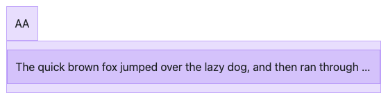
The two columns do not show side by side when the text is larger than the available width (that is, truncate comes into use).
How it displays:
Expected behaviour:

Why is this important? Two layered layouts are very common. Just adding text-truncate should not break the powerful grid layout Bootstrap has!
Reduced test cases
Sample code showing the problem: https://o1jjvb.stackblitz.io
Note that
- without nested col it works with truncate
- with nested col but without truncate it works
As it turns out, this code actually works only on v4.5.0 of Bootstrap!
https://o1jjvb-o1zlws.stackblitz.io
On investigating the changes made around 4.5.0 I found that adding min-width:0 to .col is what solved the problem. Here is that one change showing a working version:
https://o1jjvb-kchnnp.stackblitz.io
I traced why the min-width change was reverted and found these (adding here just for reference):
https://github.com/twbs/bootstrap/pull/30999
https://github.com/twbs/bootstrap/issues/31094
So may be min-width:0 is the wrong way to fix it. Can anyone tell me how to fix it properly or can we get this fix into Bootstrap?
What operating system(s) are you seeing the problem on?
macOS
What browser(s) are you seeing the problem on?
Chrome
What version of Bootstrap are you using?
5.3