Recent comments in /f/dataisbeautiful
back_from_exile28 t1_jbxf39w wrote
Non American here, What's the country with burning red?
daddy_OwO t1_jbxek9h wrote
Reply to comment by keith0211 in [OC] NBA offense vs defense season to date by Bischrob
The hornets joining them makes it even more true
LinCashew t1_jbxecf2 wrote
Reply to comment by Independent-Soil5265 in [OC] Well-being Distribution based on Income Bracket in the US by ketzu
until you become the super rich
pm_me_jupiter_photos OP t1_jbxec4u wrote
Source: FDIC Website https://www.fdic.gov/resources/resolutions/bank-failures/failed-bank-list/
Shapefile Source NWS: https://www.weather.gov/gis/USStates
Tool Used: Python / Jupyter Notebooks / matplotlib
See the full source on my github https://github.com/Apollorion/bankmap
Methescrap t1_jbxd2wt wrote
Reply to Cancer timeline: treatment for stage 3c triple positive breast cancer (all cancers are unique, this is my personal timeline; similar diagnoses will have a similar, but not identical, timeline) [OC] by BluebellsMcGee
Data is indeed beautiful, you having to deal with this kind of shit certainly is not. Hope you fully recover, best wishes from Germany.
BluebellsMcGee OP t1_jbxcqrw wrote
Reply to Cancer timeline: treatment for stage 3c triple positive breast cancer (all cancers are unique, this is my personal timeline; similar diagnoses will have a similar, but not identical, timeline) [OC] by BluebellsMcGee
Made by hand in Canva, in an effort to help my friends and family visualize my overlapping treatments.
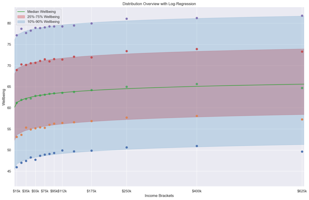
ketzu OP t1_jbxabcr wrote
Reply to comment by sparkyhodgo in [OC] Well-being Distribution based on Income Bracket in the US by ketzu
Based on the article: The relationship between income and well-being is well known to be log-linear, i.e., well-being increases based on the log of income, but the spread is fairly wide. One goal of the article seemed to be to investigate the popular "you won't be any happier after making $75k/year" and found that it is not the case, besides a small, unhappy, group.
My personal interpretation is:
More money => more happy, but not as much as one might think. Many are happy while poor and many are unhappy with high income. But that might be for many different reasons: Your level of satisfactions could just move up your baseline for when to feel better: Before, being able to afford a nice steak made you happy, now you can eat steak every day and it just doesn't cut it anymore.
The improvements are "very strong" in the low end (here you can see it better I believe), but not as much later on. If you are unhappy at $75k, I think it is unlikely that a higher income will increase your well-being in the long run (I am pretty sure most people are happy moving up on the income ladder at least short term).
But people are different, maybe for an individual that's exactly what is missing in their lives.
tilapios t1_jbx9imz wrote
Reply to comment by Dinoduck94 in [OC] Well-being Distribution based on Income Bracket in the US by ketzu
The paper cited by OP (whose comment appears to be shadow banned) cites two surveys:
- "450,000 responses to the Gallup-Healthways Well-Being Index" reported by Kahneman and Deaton (2010).
- Data from trackyourhappiness.org as reported by Killingsworth (2021).
sparkyhodgo t1_jbx9fpr wrote
What’s the takeaway, that money has only slight correlation with well-being?
ketzu OP t1_jbx8vq8 wrote
Reply to comment by Dinoduck94 in [OC] Well-being Distribution based on Income Bracket in the US by ketzu
In the publication it is measured via smartphone app at random times in the day (with respect to the participants sleeping schedules).
> After providing informed consent, participants completed an intake survey, which included demographic questions as well as two measures of life satisfaction, as detailed below. The participants were next asked to indicate the times at which they typically woke up and went to sleep, and how many times during the day they wished to report on their experiences (default = 3). A computer algorithm then divided each participant’s day into a number of intervals equal to the number of desired reports, and a random time was chosen within each interval. New random times were generated each day, and the times were independently randomized for each participant. At each of these times, the participants were signaled via a notification on their smartphone, asking them to respond to a variety of questions about their experiences at the moment just before the signal. The experienced well-being question was asked in every survey. Other questions unrelated to the present investigation were also asked. The participants received notifications requesting a report until they chose to discontinue participation. If 50 samples had been collected, reporting stopped for 6 mo or until the participant requested that it be restarted.
Independent-Soil5265 t1_jbx8fm1 wrote
Those super rich are just psychopaths that have no feeling
Dinoduck94 t1_jbx7xj2 wrote
How is 'well-being' determined?
ketzu OP t1_jbx7d0a wrote
Datasource is a scientific article:
- Income and emotional well-being: a conflict resolved" by Killingsworth, Kahneman and Mellers: https://www.pnas.org/doi/10.1073/pnas.2208661120
- Published Data by the authors: https://osf.io/qye4a/
I am not affiliated with the article or authors at all, I just used their published data.
The plot was made using seaborns violin plot and some surrounding stuff (file link).
violin = sb.violinplot(data, x='income', y='wellbeing', scale='count', inner='quartile', width=1.3)
violin.set(xlabel="Income Bracket", ylabel="Wellbeing")
violin.set_xticks(range(15), labels)
violin.set_title("Violin Plot of Wellbeing Distribution, Including Q1, Median, Q3 Highlights")
I also made another plot using pyplot to generate statistics accross the income brackets (p10, q1, median, q3 and p90). I like hat one more, but it is even less pretty.
Great_Horny_Toads t1_jbx74gm wrote
Reply to comment by EnnissDaMenace in [OC] NBA offense vs defense season to date by Bischrob
They'll work it out. They've had one of the top defenses all season.
TaliFrost t1_jbwygex wrote
Reply to comment by [deleted] in [OC] NBA offense vs defense season to date by Bischrob
Yeah, historically good. They definitely haven't dropped off, they're like 8-1 since the all star break. They just scored 128 against the Suns without a single player with 20 points.
[deleted] t1_jbwtojc wrote
Reply to comment by TaliFrost in [OC] NBA offense vs defense season to date by Bischrob
[deleted]
yukimi-sashimi t1_jbwowx0 wrote
Reply to [OC] NBA offense vs defense season to date by Bischrob
This is like that episode of The Office, waiting for the screensaver on the DVD player to hit the corner.
TaliFrost t1_jbwo0ji wrote
Reply to comment by kmmontandon in [OC] NBA offense vs defense season to date by Bischrob
They're the 2 seed in a stacked western conference and they're playing a beautiful brand of basketball. Most exciting team in the NBA!
[deleted] t1_jbwmlus wrote
Colin8tor112 t1_jbwk6by wrote
Reply to [OC] In the past four years, 19 states have enacted legislation or passed resolutions, awaiting approval by Congress, to make daylight saving permanent. by gridnews
What does it mean to make daylight savings time permanent?
EnnissDaMenace t1_jbwk3sx wrote
Reply to comment by Great_Horny_Toads in [OC] NBA offense vs defense season to date by Bischrob
??? Cavs are looking shaky af recently if you watch the games.
AboslutVodka t1_jbwj5ox wrote
Reply to [Topic][Open] Open Discussion Thread — Anybody can post a general visualization question or start a fresh discussion! by AutoModerator
I'd love to see a visualization of reddit communities. It doesn't seem too difficult for a sub to be in the top 1%
[deleted] t1_jbwh4i4 wrote
Reply to [OC] NBA offense vs defense season to date by Bischrob
[removed]
JohnnyTsunami312 t1_jbweedw wrote
Reply to [OC] NBA offense vs defense season to date by Bischrob
Bulls bounce in those middle 4 squares like an old dvd player screen saver
mlfblf t1_jbxf643 wrote
Reply to comment by Independent-Soil5265 in [OC] Well-being Distribution based on Income Bracket in the US by ketzu
The idle rich are likely bored. Pair that with people wanting to be around them because they have money, not because they are likable. Makes it lonely, too.